When it comes to creating impactful music cover art, typography plays a crucial role in setting the right tone and capturing the essence of the music. Learn how to choose the ideal fonts that align with the genre, message, and emotions conveyed by the music.
Typography goes beyond being a mere design element; it serves as a powerful communication tool in music cover art. By understanding the message and concept behind the music, you can select fonts that effectively convey the mood and personality of the album.
Different music genres have their own distinct visual aesthetics, and typography can greatly enhance the overall design. Explore how to match the genre with appropriate fonts, such as using bold and edgy typefaces for rock or metal albums, or elegant and flowing scripts for jazz or classical compositions.
While artistic expression is important, it’s crucial to ensure that the chosen fonts are legible and readable. Discover tips and techniques to strike a balance between creativity and readability, ensuring that the audience can easily interpret the text on the music cover art.
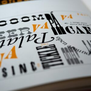
Font styles contribute significantly to the visual impact of music cover art. Delve into various font styles, from bold and edgy to elegant and scripted, and learn how each style can evoke different emotions and enhance the overall aesthetic of the design.
Contrast is a powerful design principle that can make typography stand out and grab attention. Explore techniques for pairing fonts to create visual impact, such as combining bold and thin fonts or mixing serif and sans-serif typefaces, to add depth and interest to music cover art.
For truly unique and distinctive music cover art, consider using custom fonts or exploring typography innovation. Learn how custom fonts can showcase the artist’s individuality and contribute to a cohesive visual identity.
Typography can be a reflection of the artist’s personality and style. Discover how to choose fonts that align with the artist’s vision, allowing the music cover art to become a true representation of their identity and artistry.
Typography plays a pivotal role in music cover art, enabling artists and designers to visually communicate the genre, mood, and personality of the music. By carefully selecting fonts that align with the message and aesthetics, you can create captivating designs that leave a lasting impression on listeners and viewers. Choose your typography wisely and let it amplify the impact of your music cover art.
Bestcoverartists specializes in music industry graphic design. We provide pre-made cover art, customized cover art, tracklists, animated covers, and other visuals to help your next project stand out! Shop at Bestcoverartists, save time searching for designers on the internet and prevent getting scammed!
Are you a designer looking to make some extra money by selling at Bestcoverartists? Click the button below to apply and start selling cover art. We will contact you within a week of receiving your application. Please contact us if you have any questions or would want to learn more.